
One autoplot() per object
Every result object in the package has an autoplot()
method. The call is always autoplot(x), and what it draws
depends on the class of x. Each method returns an ordinary
ggplot object, so anything ggplot2 offers, such as themes,
scales, extra layers and facet_*() arguments, can be added
on top.
| What you have | What autoplot() draws |
|---|---|
radf() result (radf_obj) |
Test statistic against the critical-value sequence, with one facet per series that rejects the null and the explosive episodes shaded |
datestamp() result (ds_radf) |
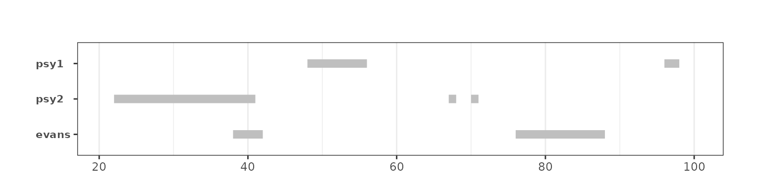
Only the episodes, as one horizontal segment per series. This is the view for many series at once |
radf_*_distr() result (radf_distr) |
The simulated null distribution of the ADF/SADF/GSADF statistics |
Any sim_*() series |
The series itself |
monitor(), monitor_*()
|
Monitored statistic against its boundary, with markers for the end of training and for the alarm |
dating_*(), radf_recovery()
|
The series with vertical markers at the estimated break dates |
rootstamp() |
Estimated root and its confidence interval per episode |
lbi_test(), quantile_test(),
radf_sbz_union()
|
Statistic against critical value for each series |
The rest of this page covers the first three rows, which belong to
the radf() workflow, and shows how to build your own plot
from the tidied tables when the defaults do not fit. The other methods
take no options beyond the object. They are described with their own
methods: vignette("monitoring") for the monitors and
vignette("dating-methods") and
vignette("root-inference") for dating and root
inference.
The radf() plot
We simulate four series, one from each of the classic bubble data
generating processes in the package (see
vignette("simulation")), and estimate them with one lag.
The critical values depend on (n, lag), so we simulate them
once and pass them to every call, as in
vignette("exuber"):
sims <- data.frame(
  psy1 = sim_psy1(100, seed = 1),
  psy2 = sim_psy2(100, seed = 2),
  evans = sim_evans(100, seed = 3),
  blan = sim_blan(100, seed = 4)
)
est <- radf(sims, lag = 1)
cv <- radf_mc_cv(100, lag = 1, seed = 1)
autoplot(est, cv)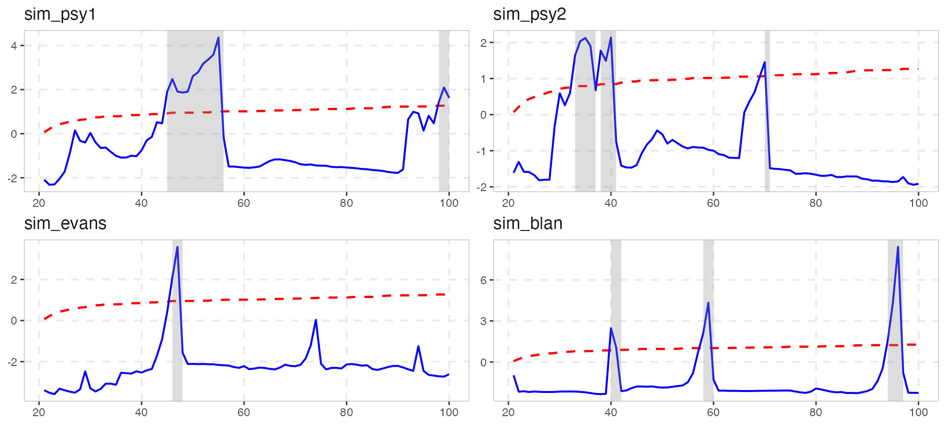
Only series that reject the null at the 5% level are drawn. The
arguments of autoplot() itself control what is plotted:
# Every series, whether or not it rejects
autoplot(est, cv, nonrejected = TRUE)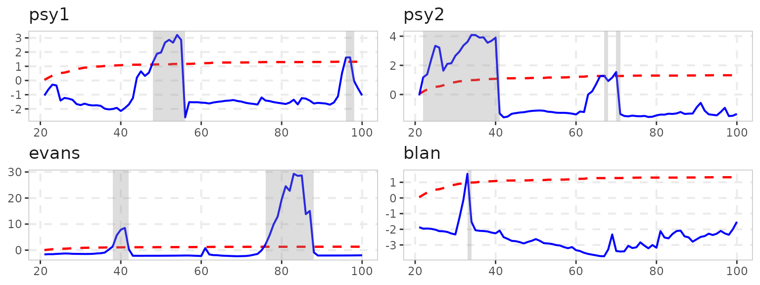
# A subset, by name or position; the SADF sequence instead of the BSADF one
autoplot(est, cv, select_series = c("psy1", "evans"), option = "sadf")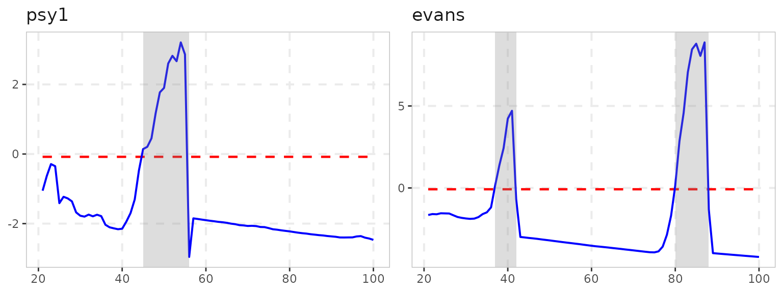
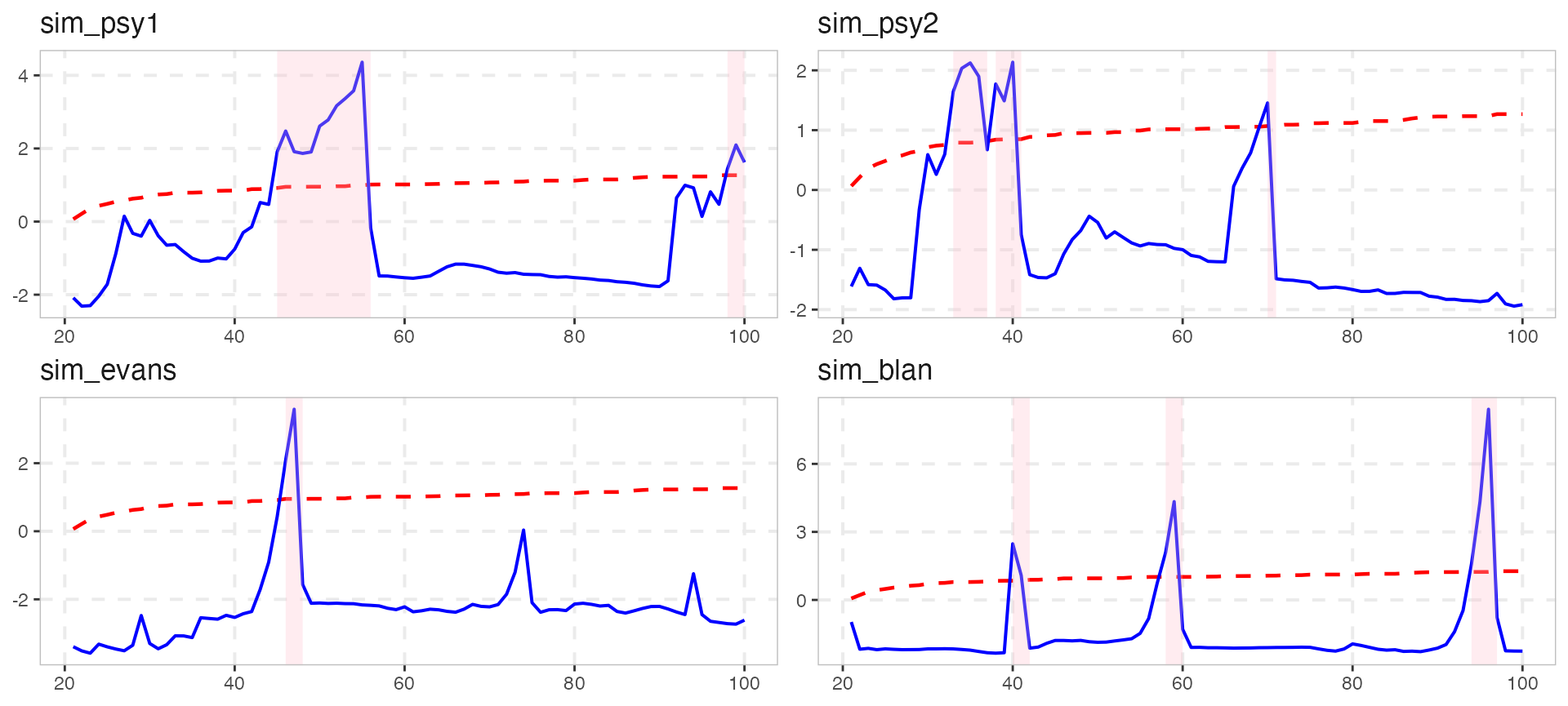
The shading of the explosive episodes is a geom_rect()
layer. The shade_opt argument and the shade()
helper control it, and shade_opt = NULL removes it:
autoplot2() draws the series itself instead of the
statistic, with the same shading. This is often easier to read for a
non-technical audience. The method for datestamp() objects
reduces each series to its episodes:
autoplot2(est, cv, select_series = "psy2")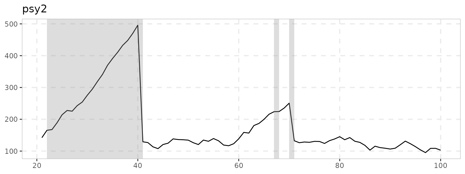
Changing the appearance
Colors, line types and themes are handled by ggplot2.
autoplot() maps the statistic and the critical value to
color, size and linetype, so the
ggplot2 scale_*_manual() functions can override them.
scale_exuber_manual() sets all three at once.
theme_exuber() is the default theme of the package, and it
is exported so that you can apply it to your own plots too:
autoplot(est, cv, select_series = "psy2") +
  scale_exuber_manual(color_values = c("grey40", "black"),
                      linetype_values = c(3, 1)) +
  theme_classic()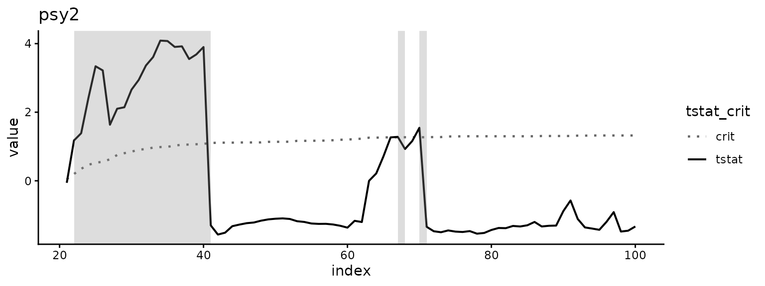
Arguments that autoplot() does not recognize are passed
on to ggplot2::facet_wrap(), so
scales = "free_y", ncol and
labeller work directly. ?autoplot.radf_obj has
a labeller example that renames the facets.
Building your own plot
When the default layout does not suit you, skip
autoplot() and start from the table it is built on.
augment_join() joins the full statistic sequences of a
radf_obj with the critical-value sequences of a
radf_cv. It returns one row per observation, series,
statistic and significance level, which ggplot2 can use as it is:
joined <- augment_join(est, cv)
joined
#> # A tibble: 1,920 × 8
#>      key index id     data stat   tstat sig    crit
#>    <int> <dbl> <fct> <dbl> <fct>  <dbl> <fct> <dbl>
#>  1    21    21 psy1   126. badf  -1.05  90    -0.44
#>  2    22    22 psy1   132. badf  -0.630 90    -0.44
#>  3    23    23 psy1   137. badf  -0.289 90    -0.44
#>  4    24    24 psy1   138. badf  -0.350 90    -0.44
#>  5    25    25 psy1   124. badf  -1.41  90    -0.44
#>  6    26    26 psy1   129. badf  -1.23  90    -0.44
#>  7    27    27 psy1   128. badf  -1.28  90    -0.44
#>  8    28    28 psy1   127. badf  -1.36  90    -0.44
#>  9    29    29 psy1   117. badf  -1.68  90    -0.44
#> 10    30    30 psy1   114. badf  -1.77  90    -0.44
#> # ℹ 1,910 more rows
joined %>%
  ggplot(aes(x = index)) +
  geom_line(aes(y = tstat)) +
  geom_line(aes(y = crit), linetype = 2) +
  facet_grid(sig + stat ~ id, scales = "free_y") +
  theme_exuber()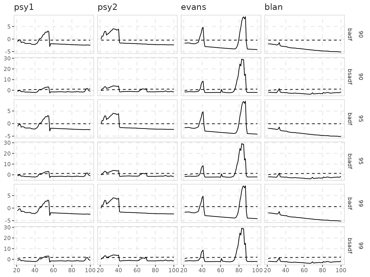
tidy_join() is the scalar counterpart, with one row per
series and statistic, which is the table that summary()
prints. Calling tidy() or augment() on either
object alone returns the two halves before they are joined. The first
part of this page describes the full pipeline.
Distributions
The radf_*_distr() functions are the counterparts of the
critical-value functions. They return the whole simulated null
distribution instead of its quantiles, and they have their own
autoplot() method:
distr <- radf_mc_distr(n = 100, nrep = 1000, seed = 1)
autoplot(distr)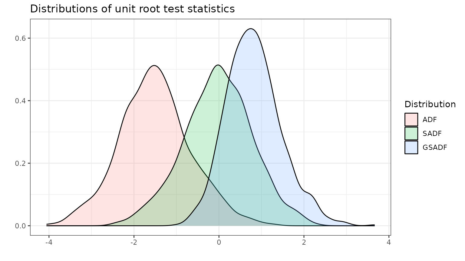
As elsewhere, tidy() returns the underlying table, so an
empirical CDF or any other summary takes only a few lines of
ggplot2:
distr %>%
  tidy() %>%
  tidyr::pivot_longer(everything(), names_to = "statistic") %>%
  ggplot(aes(value, color = statistic)) +
  stat_ecdf() +
  geom_hline(yintercept = 0.95, linetype = 2) +
  labs(title = "Empirical CDF of the null distributions", y = NULL) +
  theme_exuber()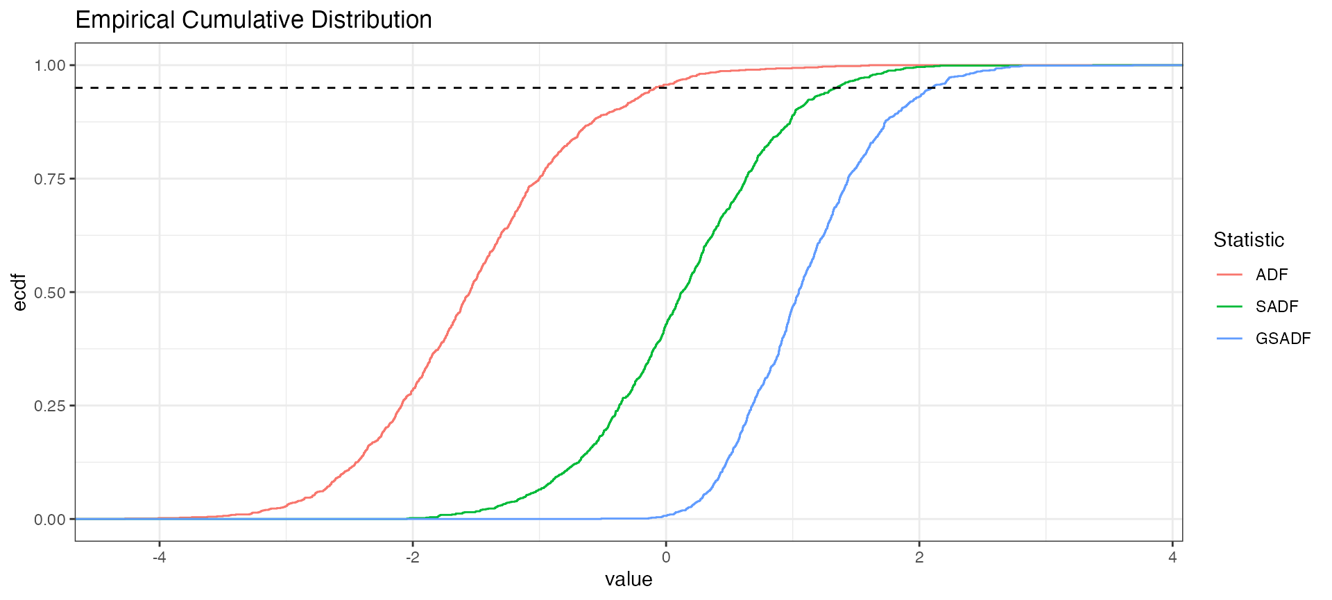
Which to reach for
- For a quick look at which series are explosive and when, use
autoplot(est, cv). Addnonrejected = TRUEto include the series that do not reject. - To show the series itself with the episodes shaded, for a
non-technical reader, use
autoplot2(est, cv). - To show only the episodes of many series, use
autoplot(datestamp(est, cv)). - For cosmetic changes, keep
autoplot()and add ggplot2 layers, scales or a theme. Usescale_exuber_manual()to style the statistic and the critical value. - For a different layout altogether, build your own plot from
augment_join(est, cv).