
Augment and then join the full statistic sequences of a radf_obj with
the critical-value sequences of a radf_cv, with one row for each
observation. This is the table autoplot.radf_obj is built on.
Usage
# S3 method for class 'radf_obj'
augment_join(x, y = NULL, trunc = TRUE, ...)Examples
# \donttest{
rsim_data <- radf(sim_data, minw = 20)
cv <- radf_wb_cv(sim_data, minw = 20)
# Join the statistic path and the critical-value path. This is the table autoplot() is built on
aj <- augment_join(rsim_data, cv)
aj
#> # A tibble: 2,400 × 8
#> key index id data stat tstat sig crit
#> <int> <dbl> <fct> <dbl> <fct> <dbl> <fct> <dbl>
#> 1 21 21 psy1 110. badf -2.36 90 -0.156
#> 2 22 22 psy1 98.1 badf -2.49 90 -0.0356
#> 3 23 23 psy1 91.0 badf -2.26 90 -0.0959
#> 4 24 24 psy1 80.4 badf -1.63 90 -0.0460
#> 5 25 25 psy1 69.2 badf -0.815 90 -0.0967
#> 6 26 26 psy1 72.3 badf -0.960 90 -0.185
#> 7 27 27 psy1 67.7 badf -0.693 90 -0.296
#> 8 28 28 psy1 69.1 badf -0.771 90 -0.350
#> 9 29 29 psy1 65.4 badf -0.609 90 -0.450
#> 10 30 30 psy1 72.4 badf -0.939 90 -0.423
#> # ℹ 2,390 more rows
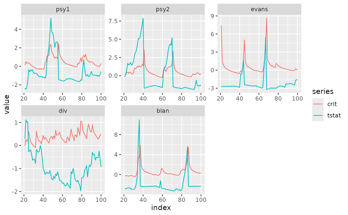
# Reproduce (a simplified version of) autoplot()'s own bsadf-vs-crit line plot
library(ggplot2)
aj %>%
dplyr::filter(sig == 95, stat == "bsadf") %>%
tidyr::pivot_longer(c(tstat, crit), names_to = "series") %>%
ggplot(aes(index, value, col = series)) +
geom_line() +
facet_wrap(~id, scales = "free")
 # }
# }